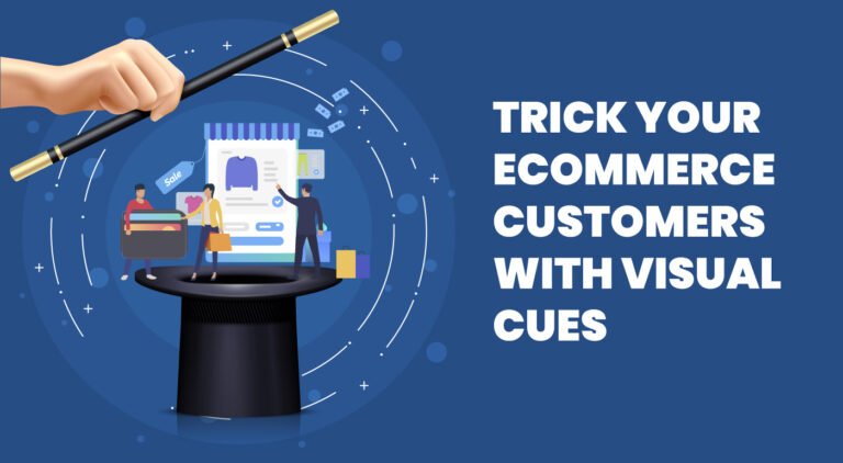
Well, the saying is pretty easy than actually doing it.
Don't worry; we will help you with some astonishing ideas that you can deploy at your ecommerce store. This can have a significant impact on the CRO of your business. When it comes to ecommerce, "the look of the product" is the sellable property. So, here we will be talking about all how you can transform your website to its visually appealing counterpart. You must be following all the ecommerce standards, creating engaging product detail pages and marketing with the campaigns to bring in conversion. But, above all you have to bring in quality traffic and more crucial is to make them stay in your store.Visual cues can make it happen, let us discuss more of them.
What are the visual cues?
The elements on the web page, which are capable of directing the visitor's attention visually to the action you want them to take are referred to as visual cues. Visual cues are often referred to as directional cues. These cues can be directed to CTA, contact forms, product page or category page.What is the need for visual cues?
As we have already mentioned, for an ecommerce business, looks matters! We, humans, are visually oriented. Naturally, visual hierarchy plays a vital role in the nature of scanning the content. Visual cues play with the scanning psychology of our brains and draw the attention of visitors towards the CTAs. The parallax websites are created with the same notion in mind. When a user gets some interactive element on the site, they can't do anything but at least play around with it through it's least possible to add a parallax theme for your ecommerce store, as they are heavy. You can always try the CSS tricks basic animations to make elements of your site engaging.Here's the list of visual cues that you can try for your ecommerce store:
Suggestive and explicit visual cues
Based on the type of approach, visual cues can be explicit and suggestive. The explicit cues like arrows, lines directly indicate towards the end goal. It's a direct approach, and there is no guesswork involved. Explicit visuals are easier to understand. Thus, they often gain more attention than suggestive ones. On the contrary note, suggestive visual cues need understanding about their utility. They are surely capable of delivering much deeper messages. The explicit approach can be good for conversion, and suggestiveness can do much better at sharing the emotion or adding a message of your brand. Taskworld has used the suggestive idea to deliver the message of connecting remote workers as a team.Take colour contrast
Ecommerce businesses play with colours more than often. Don't you put that white background to give a clear look of all the products and a dark background for light coloured products? Of course, you do that! The primary reason behind is contrast colours amplify the look of the product. With an understanding of colour philosophy, it is really easy to trigger customer action. During web page design, you can add a contrast colour section for your banners and category pages. Like, Amazon uses dark blue on the header section, light colour for banners, and varying colour schemes for category pages. One shoe doesn't fit all the sizes. Likewise, Amazon has different product imaging requirements for different product categories. Before working on the product detail pages, you can refer to its imaging guidelines. It can be a lot helpful in walking with the standards and improving the quality of the product detail pages.Frame your content
The frame or boundary of the content is also capable of drawing the user's attention. Let's consider, you have all the product categories listed on the homepage of your store, but you want to bring the focus of your customers on the product category that you have recently launched. Here are a few ideas that you can try:- Play with the colour philosophy: Set the background colour for all of your existing categories white, and give some dark background for the newly launched category. Out of curiosity, visitors will be driven towards your new category.
- Add the frame: You can add a thick frame near your new category. The encapsulation will change the approach of the visitor towards the displayed content.
- Make it interactive: In addition to all the above things, you can tweak the CSS and add animation. The change can be as small as the arrival of the frame on hovering, or change of background colour, display of carousel images of the products of that category or anything else.


 Sharing Project Details
 Let's have a
call
 Got
Questions? Let’s Chat!