Introduction
Open any app store or scroll through a social feed and most brands blur together: a tidy logo, a friendly tone, a promise nobody remembers an hour later. A character is much harder to forget. Duolingo’s green owl is a good example. Plenty of people can describe his personality, from the pushy reminders to the dramatic sad face, without ever having read a brand guideline. That is the clear answer to how a mascot helps in branding: it turns a company name into someone people can picture, describe and talk about.
A mascot is not magic, though. A character with no clear purpose, or one that changes personality from one channel to the next, adds confusion rather than character. The ones that work are designed around what the brand stands for, and then used with discipline on websites, social media, apps, packaging and events.
Whether you run a growing business, lead a marketing team or are launching a digital product, this guide covers the benefits of mascot branding, ten well-known mascots and the practical lesson each one offers, where to use a character in your marketing, and how to create and measure one for your own brand, step by step.
What Is a Brand Mascot?
A brand mascot is a character created to represent a business. Planters’ Mr. Peanut, a peanut in a top hat and monocle, tells you something about the brand before you read a word. A mascot gives a company a personality, whether playful, dependable or cheeky, and a face that people remember.
Mascots take many forms: animals, people, everyday objects or entirely invented creatures. The form matters less than the fit. The character should look and sound like the business it speaks for.
What Is the Difference Between a Mascot and a Logo?
A logo identifies a brand. A mascot speaks for it. Your logo sits on the invoice, the signboard and the app icon, and it rarely changes. A mascot can wave, joke, point to an offer or star in a short video, which gives your marketing something a fixed mark can’t do.
| Logo | Brand mascot | |
|---|---|---|
| Role | Identifies the business | Gives the brand a personality |
| Form | A name, symbol or mark | A recognisable character |
| Appearance | Fixed, rarely changes | Changes pose, expression and setting |
| Best used for | Invoices, signage, app icons | Social media, campaigns, videos, customer interactions |
The two don’t compete. Many businesses keep their logo and add a mascot for social media or campaigns, and some build the character into the logo itself.
How Does a Mascot Help in Branding?
Short answer: a mascot gives people something to remember, relate to and recognise. The longer answer has six parts, and one caveat comes first. A character only delivers these benefits when it’s designed with care and used consistently. (A random cartoon slapped on a brochure won’t do any of it.)
Builds Brand Recognition and Recall
Faces and figures stick in memory better than names or abstract marks. Think about how many logos you’ve scrolled past today, then ask how many you actually remember. A character gives people more to hold on to, especially when it has:
- A simple silhouette that still works at small sizes
- A tight colour palette
- One or two signature details, like an accessory or a recurring expression
Each appearance builds on the last, so the brand gets quicker to spot over time.
Gives Your Brand a Distinct Personality
A logo can hint at friendliness or confidence, but it can’t act friendly or confident. A character can, through:
- Design: soft, rounded shapes feel welcoming; sharper lines feel capable
- Expressions and gestures: a raised eyebrow often says more than a tagline
- Voice: how the figure speaks sets the tone for everything written around it
So instead of telling customers you’re playful, you show them.
Creates an Emotional Connection With Customers
People warm to characters they know. When one celebrates a milestone, reacts to a mistake or simply says good morning, the business feels less like an institution and more like someone you could chat to. That makes it easier to approach and more pleasant to deal with.
Let’s be realistic, though. Trust and loyalty come from your product and service, not from a drawing. What the character does is make the first step easier.
Helps Your Business Stand Out From Competitors
Plenty of markets look the same: similar offers, similar prices, similar logos, similar tone. An original character is hard to mistake for anyone else’s, so it gives customers a quick way to tell you apart. It works best when:
- Competing offers are close in price and features
- The concept is genuinely yours, not borrowed from a rival
- The personality reflects something true about your business
Makes Brand Storytelling More Memorable
A logo can’t star in a story; a character can. It might headline a campaign, run through a seasonal series, solve a customer’s problem in a thirty-second video, or grow and change alongside the business. Audiences follow characters from one instalment to the next, so every new piece of content has something to build on. And a story about a character is far easier to retell than a list of company values.
Supports Consistent Marketing Communication
Your brand probably shows up in more places than you’d think:
- Websites and landing pages
- Emails and social posts
- Mobile apps and digital products
- Packaging, events and merchandise
Using one character across all of them ties the pieces together, even when different teams or agencies produce the work. A shared set of poses, expressions and tone notes helps too, because everyone starts from the same page, which saves a lot of back-and-forth in creative reviews.
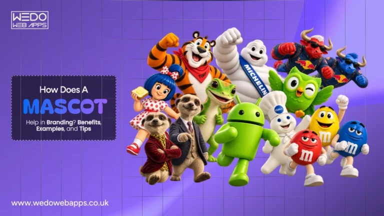
Examples of Successful Brand Mascots
The easiest way to understand what a character can do for a brand is to watch ten of them at work. They’re grouped below by the lesson each one teaches best, although several could sit comfortably in more than one group.
Mascots That Build Brand Recognition
Recognition comes from repetition. These three characters have stayed in front of audiences for decades, in very different ways, and each has kept its core identity intact while the world around it changed.
Amul Girl
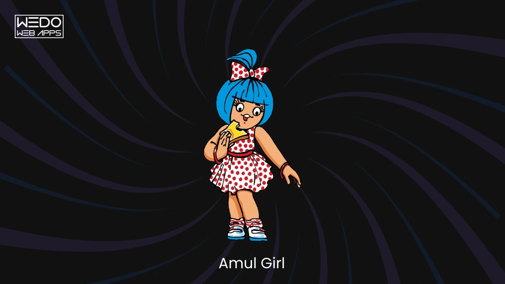
Since 1966, a little girl in a polka-dot dress has turned Amul’s butter hoardings into a running commentary on the week’s news, sport and cinema, usually delivered through a pun. The layout, the voice and the tagline barely change, so people recognise an Amul ad before they have finished reading it. That familiarity lets the brand react to events within days, without ever sounding like a different company.
- What it communicates: a witty, observant brand that is in tune with everyday conversation
- What to learn: a fixed format and voice lets one character carry hundreds of different messages
Michelin Man
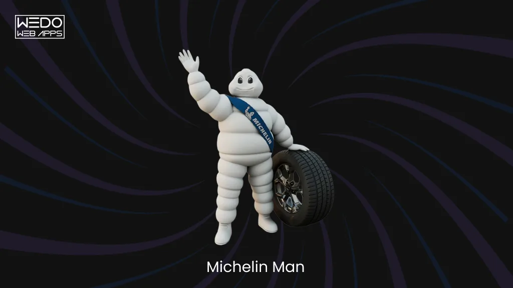
Bibendum first appeared in 1898, drawn by the cartoonist O’Galop, and the story goes that he was inspired by a stack of tyres. Over the decades he has been redrawn many times, growing slimmer and friendlier, yet the stacked, rounded body still reads as Michelin at a glance. Each redesign refreshed him without replacing him.
- What it communicates: durability and reliability, with a friendly face on a heavy-duty product
- What to learn: a character can evolve with changing tastes as long as its core silhouette stays recognisable
Android’s Bugdroid
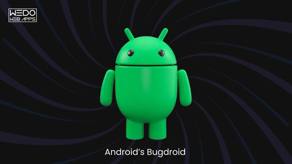
Designed by Irina Blok at Google, the little green robot was released under a Creative Commons licence, which allowed it to appear in countless colours, costumes and poses at events, on merchandise and across devices. Through all that variety, the simple body and two antennae keep it unmistakably Android. It gives a technology that is hard to picture a small, approachable face.
- What it communicates: openness, playfulness and approachability in a technical product
- What to learn: fix a few defining traits, then allow plenty of flexibility around them so the character can travel across products
Mascots That Give Brands a Distinct Personality
A personality shows most clearly in how a character behaves. These three give their brands a temperament, not just a look, and each ties that temperament back to what the company actually sells.
GEICO Gecko
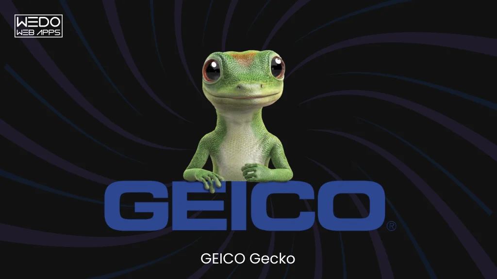
Introduced in 1999, the gecko began as a neat solution to a pronunciation problem, since people kept saying the company’s name as “gecko”. With his friendly Cockney voice and dry wit, he makes car insurance, a category most people would rather not think about, feel lighter and easier to approach. The character does the warming up; the brand still has to deliver the policy and the service.
- What it communicates: approachable, slightly cheeky, never stuffy
- What to learn: a low-interest service can borrow warmth from a character without changing what it sells
Pillsbury Doughboy
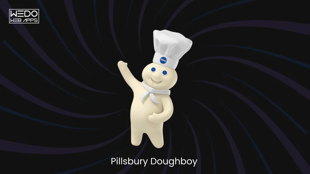
Poppin’ Fresh debuted in 1965, created by Rudy Perz at the agency Leo Burnett. A gentle poke in the belly earns a giggle, a gesture that echoes soft, fresh dough in the can, while the chef’s hat and cheerful manner tie him firmly to home baking. Nearly everything about his personality points back to the product.
- What it communicates: warmth, freshness and the comfort of baking at home
- What to learn: a signature gesture that mirrors the product becomes instant shorthand for the brand
Tony the Tiger
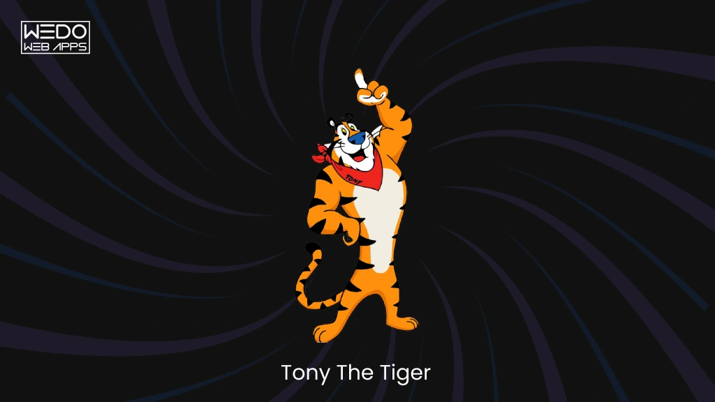
Since 1952, Tony has fronted Kellogg’s Frosted Flakes with boundless energy and a catchphrase, “They’re Gr-r-reat!”, that people can still repeat. He is upbeat and encouraging, a little like a sports coach, and that attitude has stayed steady through generations of packaging and advertising.
- What it communicates: energy, optimism and a good start to the day
- What to learn: a distinctive voice and signature phrase give audiences something to repeat, which keeps messaging consistent
Mascots That Support Digital Engagement and Storytelling
Online, a character has to do more than sit on a pack. It has to turn up in feeds, notifications and stories, often daily, and stay in character every time.
Duolingo’s Duo
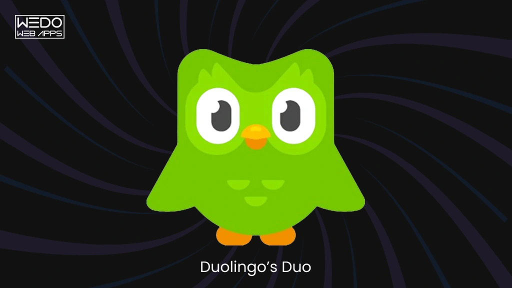
Duo lives in two places: inside the app, on lesson screens, celebrations and reminder notifications, and outside it on social media, where the owl’s exaggerated, slightly menacing persona has become a running joke. Because the voice is the same in both places, a streak reminder feels like Duo nudging you, not a system alert.
- What it communicates: a playful push to keep learning, with a touch of mischief
- What to learn: in a digital product, a character can make routine moments feel human, provided it never gets in the way of the task
M&M’s Characters
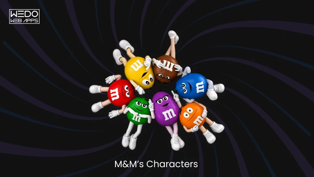
Red, Yellow and the rest of the colour-coded cast each have a temperament of their own. Red is sarcastic, Yellow is sweet and a little naive. Different personalities allow different jokes and storylines, so campaigns can change from year to year while the brand stays familiar.
- What it communicates: fun, variety and a brand that doesn’t take itself too seriously
- What to learn: a small cast offers more creative range than one character, as long as each is clearly distinct
Red Bull’s Animated Characters
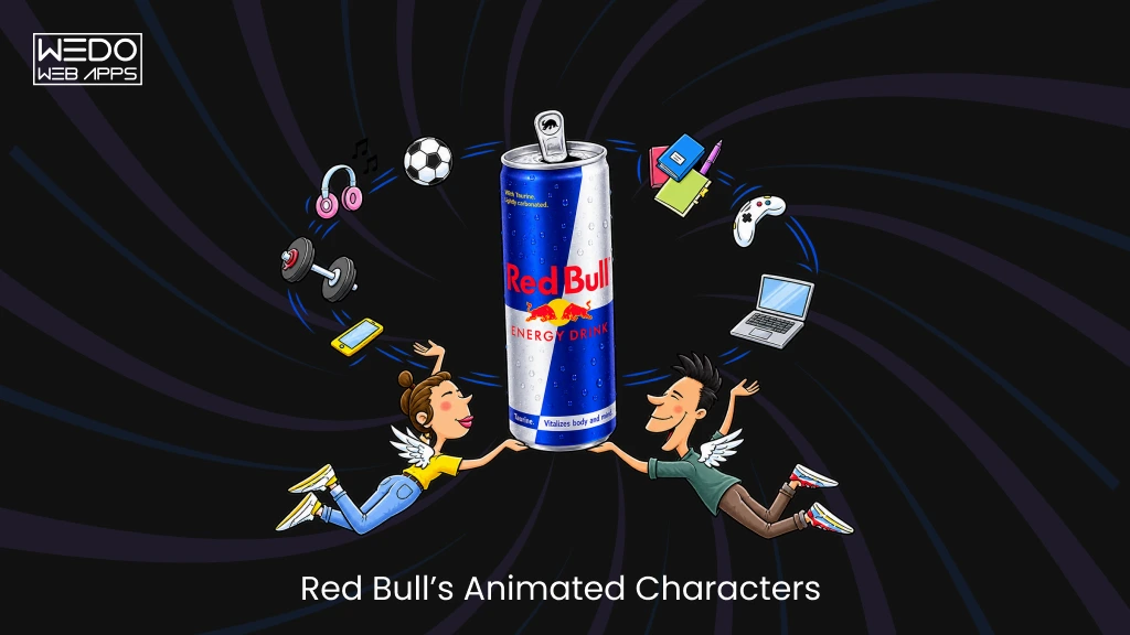
Red Bull’s long-running animated ads are best described as campaign characters, not a single mascot. Each short film introduces a new cartoon figure with a small problem that the “gives you wings” line then solves, all in the same hand-drawn, deadpan style. The characters change; the style and the joke stay put.
- What it communicates: a dry, irreverent sense of humour and a promise of energy
- What to learn: a recognisable creative style can hold a campaign together even when the cast rotates
Compare the Market’s Meerkats
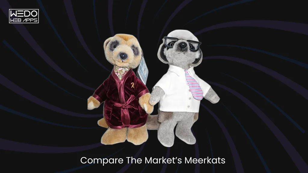
When Compare the Market launched its meerkat campaign in 2009, Aleksandr Orlov and his fellow meerkats turned a price-comparison site into an ongoing storyline. They have names, families and a catchphrase, “Simples!”, and the ads follow their lives as much as the product. In a category where services look much alike, the characters gave the brand its own territory.
- What it communicates: a quirky, friendly alternative to a dry comparison service
- What to learn: named characters and recurring stories can be as distinctive as the product itself
Look across all ten and the pattern is the same: a clear idea, a consistent look and voice, and years of patient repetition. None of this guarantees results. These characters work because they fit the brands they represent, and that fit is the real test for any business considering one.
How Businesses Can Use Mascots in Branding and Digital Marketing
Start by listing where customers already meet your business. Each of those places is a candidate for a character.
Websites and Landing Pages
Put the character where visitors hesitate. A hero illustration sets the tone in a second. A short animation explains a product faster than three paragraphs of copy. Next to your main call to action, a small figure pointing at the button earns attention.
- Campaign artwork
- Product explainers
- One standout prompt, not five
Keep the artwork from outshining the button.
Social Media and Advertising
Feeds reward the brands that show up regularly. Give the character a weekly slot: a Tuesday tip, a ten-second video, a reply in its own voice. Campaigns work the same way when the story is told through the character’s eyes. Followers start tuning in for the character, not just the offer.
Mobile Apps and Digital Products
In an app, help comes first and charm second. Step in when the user is stuck or has just finished something.
- Onboarding: explain the first few taps
- Empty screens: a blank inbox or basket is a good spot for a friendly line
- Reminders: nudge, don’t nag
- Confirmation: say well done when a task is complete
Keep it short and easy to dismiss. By the third visit, anything repetitive turns into noise.
Packaging, Events and Merchandise
Offline, the same figure goes on boxes, walks around events in costume, and turns up on stickers and tote bags. Customers meet the brand in person, and it looks like the one they already know online.
How to Create a Brand Mascot for Your Business
Six steps take you from a blank page to a character you can use with confidence. Skip one and it usually shows in the finished result.
Step 1. Define Your Brand’s Personality and Purpose
Decide what the character is for before anyone draws a line. Should it make a technical product feel less intimidating, give a service business a friendlier face, or carry your campaigns from one season to the next? Your answer shapes everything that follows.
Pick three personality traits that match your positioning, such as warm, witty and dependable, and write them down. Every later decision, from colour to catchphrase, should trace back to those three words.
Step 2. Research Your Target Audience
Find out who will meet the character and where. A children’s snack brand and a B2B software company need very different figures, and cultural context matters too, because animals, colours and gestures mean different things in different places.
- Age, tastes and the platforms your audience uses
- Characters your audience already likes, and the ones your competitors use
- Where the character will appear most often, from app screens to shop shelves
A few conversations with real customers will tell you more than any mood board.
Step 3. Choose the Right Character Concept
You have four routes, and each comes with a trade-off:
- Human: relatable, but harder to make distinctive
- Animal: easy to make expressive and memorable
- Object-based: ties straight to a product, like a peanut or a stack of tyres
- Fictional creature: the most original, though it needs more explaining
Sketch two or three options for your front-runner and compare them side by side. Choose the concept that fits your brand’s story, not the one that happens to be fashionable this year.
Step 4. Develop the Character’s Design and Personality
Now the drawing begins. Settle on a simple silhouette, a limited colour palette and one or two signature features, such as an accessory or a recurring expression. Aim for a shape people could recognise in shadow.
Then give the character a personality. Build a small set of expressions, a few habits and a clear tone of voice. Write sample lines: how does it greet a customer, or apologise for a delay? If those lines could belong to any other brand, keep working.
Step 5. Test the Mascot Across Different Formats
Shrink it to an app icon. Print it in one colour. Animate it. A design that looks great on a poster can fall apart at 32 pixels.
- Check that it works for people with colour blindness and that any text stays readable
- Try it on light and dark backgrounds
- Confirm it can be simplified or animated without losing its identity
Then show it to a few people from your audience and ask what they think the character stands for. If the answer isn’t what you intended, revise before launch.
Step 6. Establish Mascot Usage Guidelines
Write the rules down. A short guide should cover:
- Approved poses, colours and expressions
- Tone of voice, with a few do and don’t examples
- Which channels use the character, and which don’t
- Who signs off new artwork
Guidelines keep the character steady when agencies, designers and teams change. A two-page document is enough to start with, and it can grow as the character does.
When Should a Business Use a Brand Mascot?
Not every business needs one, and plenty would do better spending the money elsewhere.
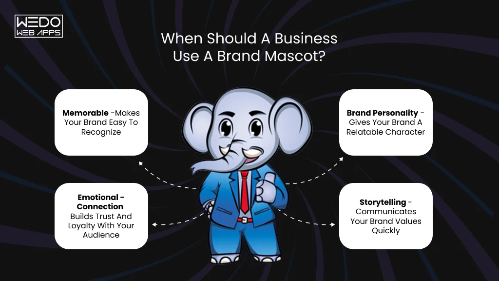
A character does its best work in a few places. A snack on a crowded shelf needs something to get picked up. An app needs a friendly voice when a payment fails or a lesson ends. Insurers, banks and utility firms sell things people put off thinking about, so a likeable face helps them. And if you publish videos and campaigns every week, one recurring figure saves you from reinventing the look each time. Size doesn’t decide it. A two-person startup with an app can need a character more than a large firm with a single product.
Now the awkward part. A drawing can’t rescue shaky foundations. Hold off if:
- Customers still can’t say what you do
- Your pitch sounds just like your rivals’
- The logo and website look tired or mismatched
- Nobody will look after the figure once it launches
Fix those first. Put a cartoon over muddled positioning and the muddle only gets louder. Budget matters too. Good illustration, animation and guidelines cost real money, and a small business with one social account may get more from sharper copy.
Before you commit, try a quick test. Picture the face on your homepage, in your social feed, and inside your product. Can you say what it’s doing in each place? Good, start exploring. Can’t? Wait.
Common Mistakes to Avoid When Creating a Brand Mascot
Most failed characters go wrong for the same handful of reasons. Watch for these six.
Designing without a clear purpose. If nobody can say what the character is for, it ends up as decoration. Customers notice, and so does your budget.
Copying another brand’s idea. A friendly gecko, a cheeky meerkat or a talking owl has already been claimed. A lookalike makes you the imitation and can bring legal trouble with it.
Making it hard to reproduce. Fine detail, gradients and a dozen colours look great on a billboard and turn to mush on an app icon, a stitched cap or a one-colour print. If a freelancer can’t redraw it from memory of the rules, the design is too complicated.
Letting the personality drift. The character is witty on social media, stiff on the website and bossy in emails. Customers stop believing in it. Pick one temperament and hold it across every channel.
Ignoring culture and accessibility. Gestures, animals and colours carry different meanings in different places, and a joke that lands in one market can offend in another. Low contrast, tiny text and flashing animation shut some people out entirely.
Leaning on it to do everything. A charming character can’t make up for a confusing offer or poor service. If the experience behind it disappoints, the mascot just becomes the face of the disappointment.
Fix these early, and the character has a fair chance of working.
How to Measure the Effectiveness of a Brand Mascot
Here’s the awkward truth: a character is easy to love and hard to measure. So do one thing before launch. Write down where you stand today, covering recognition, engagement and conversion rates. Skip this and every “after” number is a guess.
Then track four things:
- Recognition and recall. Run a short survey. Show people the figure without your logo and ask whose it is. Do it again in a few months, then compare.
- Engagement. Put character-led posts, videos and emails up against your normal content. Views, shares, comments and watch time all count.
- Clicks and conversions. Place the figure beside a call to action, then test it with and without. If sign-ups drop, the character is in the way.
- Feedback. Read the comments and support emails. Ask customers to describe your brand in their own words, then see whether the traits you chose back in Step 1 come up.
Be careful about who gets the credit. Sales climb for plenty of reasons: a seasonal peak, a price cut, a bigger ad budget. Launch in a strong quarter and the character may deserve a slice, though rarely the whole pie. Change one thing at a time where you can. And be patient, because recognition builds over months, not days.
Conclusion
A mascot is one of the few branding tools that can show personality instead of describing it. Done well, it gives people a face to remember, a voice to recognise and a thread that runs through your website, social feed, app and packaging. Amul’s girl, Bibendum and Duo aren’t famous because they’re cute. They’re famous because someone gave each one a clear job and kept it consistent for years.
That is the real lesson of this guide. A character works when:
- It has a purpose tied to your brand’s positioning, not just a pleasing design
- Its look and voice stay the same wherever it appears
- It is tested in real formats, from app icons to print, before launch
- It is measured against a baseline, and not credited with every win
It also has limits. A mascot can’t repair unclear messaging, a dated identity or a poor customer experience. If any of those need attention, start there and bring the character in once the foundation is solid. For consumer brands, digital products and service firms that want to feel more approachable, the right character can become one of the most recognisable things they own.
If you’re weighing up a character for your own brand or product, our graphic design services are a good place to start. Tell us what you’re trying to achieve, and we’ll help you work out whether a mascot is the right move and what it should look like if it is.